
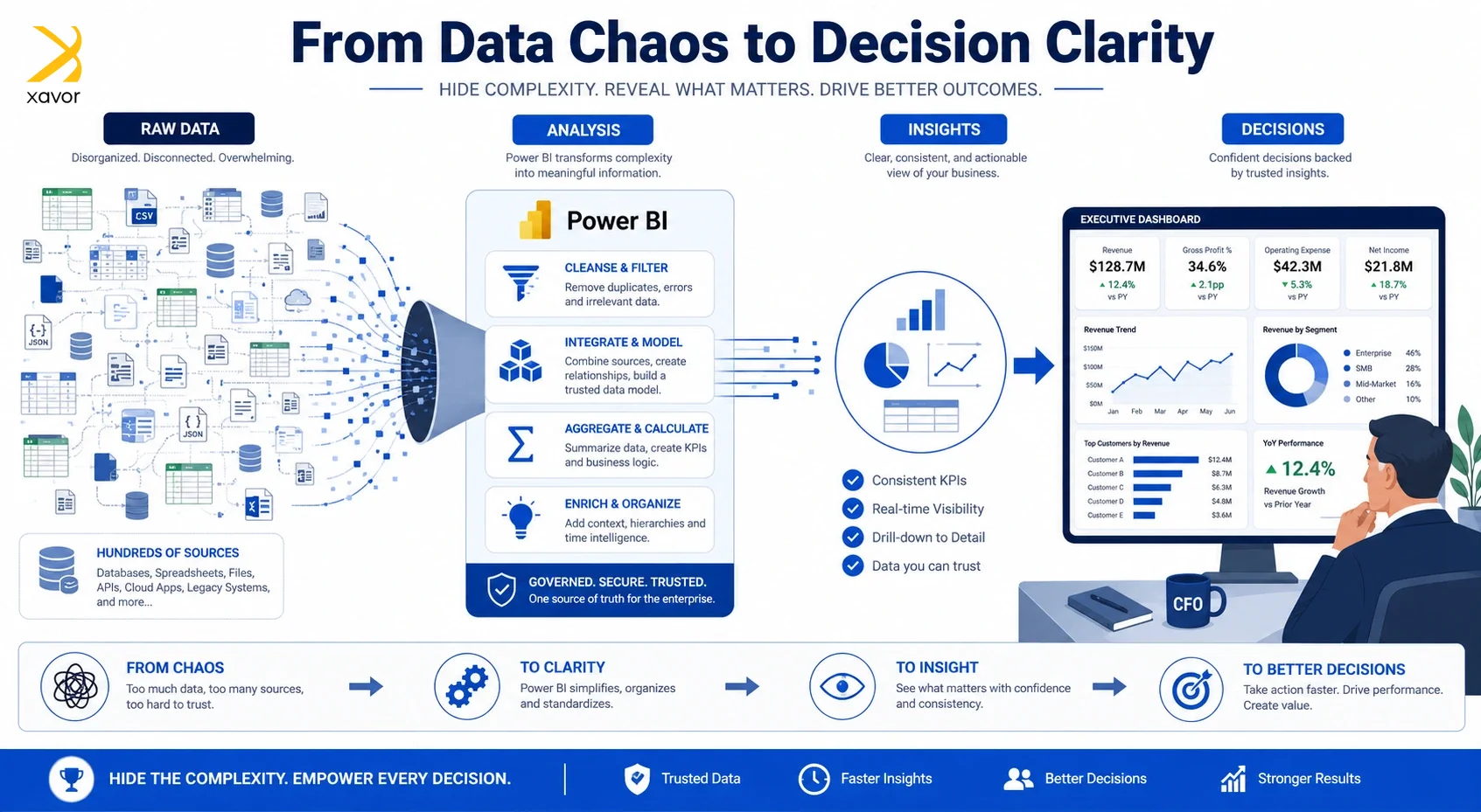
Microsoft Power BI is arguably one of the most intuitive, user- and developer-friendly data visualization and business intelligence tools out there. It also sets itself apart from the competition through tight integration with various disparate data sources, third-party customization options, and AI features powered by Copilot.
That is why it is one of the most used tools by BI and data analytics services. But perhaps what people love the most about this software is that it looks great, both from a developer and user’s perspective.
And this benefit is not only limited to pretty visualizations and aesthetics. But more important aspects like optionally hiding data complexity from the end-user.
In this blog, we’ll look into the multiple native methods available in Power BI that developers can use to hide the complexity of the underlying data and visuals from the end-user.
Why users don’t need to see every detail behind data
Don’t make simple things complicated. That is really the core reason why Power BI provides tools to abstract superfluous details behind any piece of data. Let’s expand on this point further.
1. Top leadership wants high-level answers
Usually, people who make business reports are not the ones who use them. A CEO or CFO doesn’t care about the minutiae behind a company’s increasing spendings. They only want to know why the expenses have increased.
That is why you need to skip low-level details to provide them with a high-level answer quickly. And only go deeper if the leadership demands, or it is really important to understand the problem.
Journalists present information this way all the time with the inverted pyramid model. It’s just how human curiosity and thought process works.
2. Enterprise data is messy and vast by default
Business data is like raw ore. You need to find out the valuable parts from a sea of data after careful judgement and processing. So, putting dozens of tables and hundreds of columns in a Power BI report is practically useless.
It would put enormous cognitive overload on the users. This is a well-established psychology fact that humans can only process a limited amount of information at once. Dumping everything on a single screen overwhelms people and makes them less effective at making decisions.
3. It is better than alternatives
The other options are to build separate reports for every type of user, or bombard everyone with full detail by default. But Power BI allows that the same report might be viewed by a CEO who wants a 30-second summary and an analyst who wants to dig into daily granularity. One report serve both as the surface stays simple for the executive, but the depth is there for whoever needs it.
Power BI features that simply data presentation
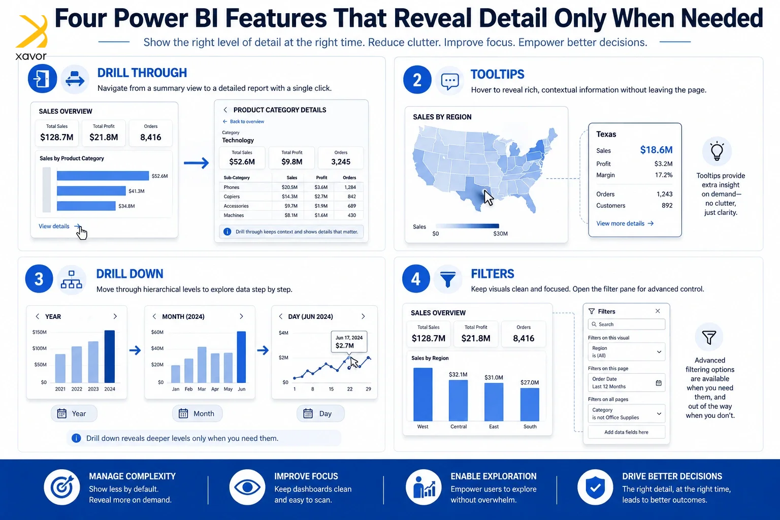
1. Drill Through
Drillthrough functionality does exactly what it says on the tin. Developers can build visuals that summarize the data in an aggregated form, and then give the business user the ability to right-click a particular datapoint and drill through to view more details.
Imagine a CFO seeing the expense report trended month-over-month (MoM) in a bar chart and noticing an apparent anomaly in the latest month. They can simply right-click the bar and drill through to a completely new page that contains a more detailed breakdown of that particular month’s expenses.
It’s worth noting that developers need to take specific steps in order to implement this, and that it does not work across all visuals. There are numerous other technical nuances to keep in mind as well when building this functionality, and it’s not enabled by default.
2. Tooltip
A tooltip is similar to a drillthrough, but rather than navigating to a completely new page altogether, business users can simply hover over a particular datapoint and see more details about it. So, if we look at this from the lens of the previous use-case, the business user would simply hover over the anomalous bar, and see additional details in a small window that pops up.
While this sounds great on paper, there are a few things to keep in mind while building tooltips. Some visuals in Power BI have tooltips by default, while for others, you’ll need to explicitly design them. Additionally, a tooltip is read-only. Power BI features offer absolutely no interaction with a tooltip, not even scrolling behavior.
Finally, tooltips pop up on hover so they can take up a significant chunk of your display real estate. As such, it’s important to be mindful of your custom tooltip’s design.
3. Drill Down
Many customers mistakenly believe that a drillthrough and a drilldown is the same thing. While a drillthrough can be generalized across use-cases as a way to navigate from an aggregated view from a detailed view, a drilldown is a very specific functionality for a particular type of data, namely, hierarchical.
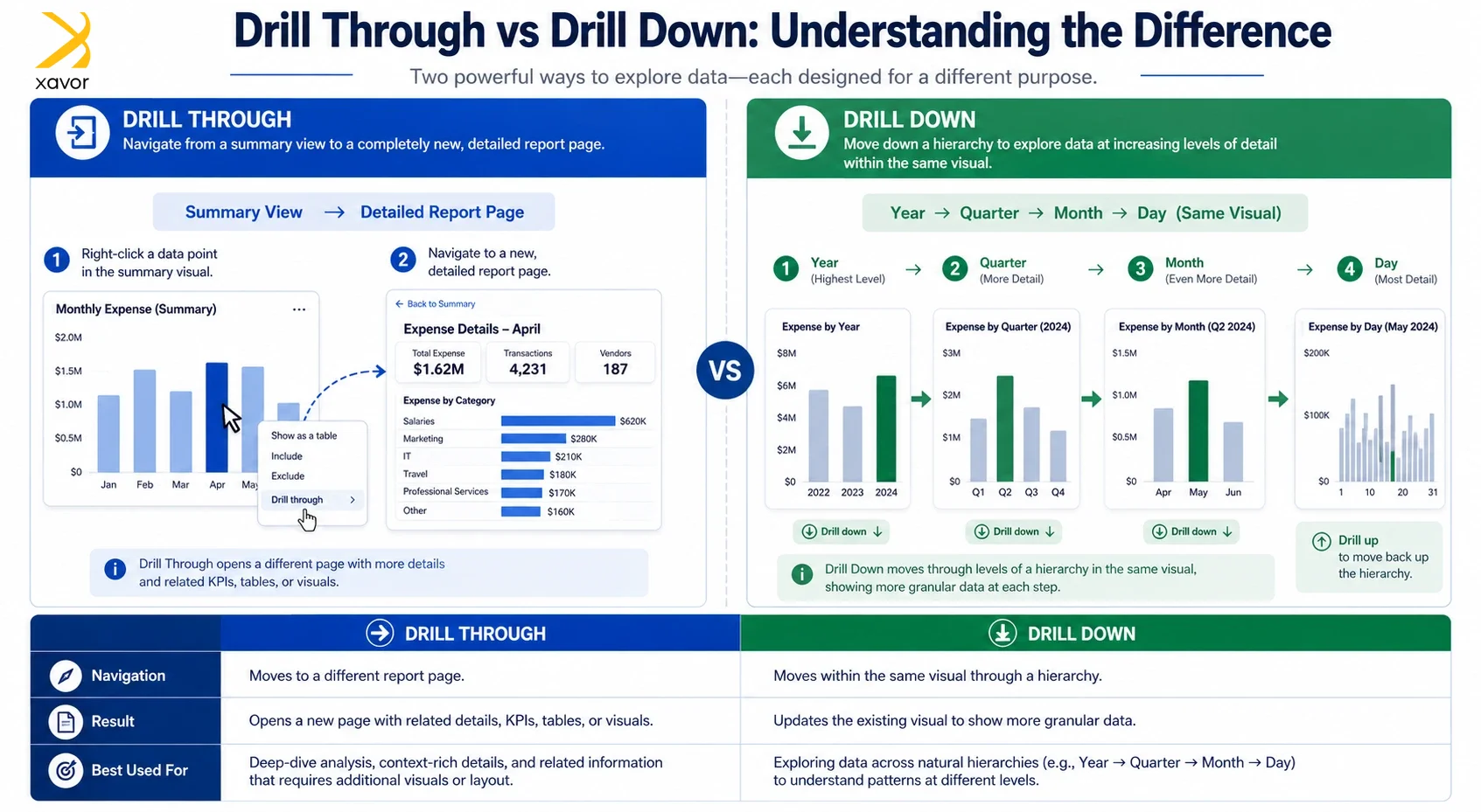
If we examine the same use-case of a CFO viewing an expense report in a bar chart, a drilldown would basically allow them to drill down from a monthly level to a daily granularity, depending upon the granularity of the data. Similarly, they may also be able to drill up to view a year-over-year (YoY) trend for a big picture view.
A drilldown cannot be implemented across all types of visuals and across all types of data. You need to design and structure your data in a way such that it is hierarchical and contains your desired level of granularity.
4. Filters
Although Power BI offers the ability to filter data using slicers, they can get very overwhelming for the report’s user on a large and complex dataset. Most report designers only place a handful of slicers in their reports because they take up space on your report and can be too confusing.
However, there are certain scenarios where you want the business user to slice and dice the data in more ways and putting 20+ slicers to solve this problem isn’t really a good idea.
Fortunately, Power BI offers the ability to place filters in a dedicated pane on the report that can be expanded and used by the end-user to slice the data beyond what is visible to them via slicers.
Let’s go back to the case of the CFO monitoring expense reports again. Perhaps, they have 4-5 visible slicers in the report allowing them to choose their desired time period, factory, department, and cost center.
But the CFO also wants to filter by the type of expenses. Rather than placing yet another slicer for this scenario, developers can simply add the “type of expense” or equivalent field to the filters pane, which the CFO can access on demand, eradicating the need for more real estate in the report.
Filters are an extremely powerful tool and can be applied at a visual, page, and report level. They hide the complexity of the underlying slicing options by making them accessible on demand rather than overwhelming the business user as soon as they open a report.
Conclusion
Data is only as valuable as the decisions it enables. Power BI understands this deeply, which is why features that we mentioned make sure the right person should see the right level of detail at the right time.
A well-designed Power BI report is, in essence, a conversation between the data and the decision-maker.
“Simplicity is the ultimate sophistication,” Leonardo da Vinci.
And simplicity in an enterprise leads to an entire business move with confidence that only comes from clarity.
If your reports are still overwhelming your stakeholders, it’s time for a change. Partner with Xavor’s BI and data analytics services by dropping us a line at [email protected] to transform your data into decisions now.

FAQs
Drill Through navigates you to an entirely new report page with more detail about a specific datapoint, while Drill Down lets you move through levels of a hierarchy, like months to days within the same visual.
No, some visuals have basic tooltips built in, but custom tooltips and Drill Through functionality require developers to explicitly design and configure them, and not every visual type supports both features.
Because cognitive overload is real. Overwhelming executives or non-technical users with raw, granular data slows decision-making rather than improving it, so surfacing only what's relevant keeps reports actionable and efficient.