We live in an era of advancing technologies, where the internet has become a necessity for everyone. Whether for business or personal use, having a professional responsive website is no longer optional—in fact, it’s essential. In the early days of the web, most people only used desktop computers. But today, you can easily access the web through a laptop, tablet, desktop, car, foldable phone, and even a refrigerator.
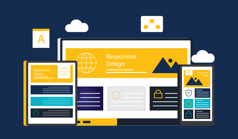
Responsive web design is a design strategy that develops websites that work well for all devices, i.e., mobiles, tablets, desktops, laptops, etc. If you aim to build a professional, responsive website, you first need to have the right mindset for making layouts. This means that before you write a single line of CSS code, you need to decide that your website must be responsive, i.e., it should work well on large and small screens alike, and there shouldn’t be any text overlaps. Moreover, your website should adapt to the viewport, and you should not lose any content or insert images that are too large for the layout.
What Makes a Website Responsive?
A professional, responsive website is designed to work well with mobiles, tablets, and desktop devices. It means using HTML and CSS to automatically adjust a website’s size and layout to fit on any given device.
Why is a Professional, Responsive Design Important?
First and foremost, Google considers mobile-friendliness in its search engine rankings. In other words, if your website isn’t compatible with mobile phones, it will negatively impact its SEO performance.
Additionally, a professional responsive design increases mobile traffic and provides a better user experience. Creating a responsive website also saves you costs because you don’t have to develop and maintain separate apps for desktop and mobile.
Understanding Breakpoints
Breakpoints are very important in understanding how responsive websites work. They are predefined points at which a website’s layout adapts for a better user experience.
Adding breakpoints ensures that a website looks and functions well on various screen sizes. Therefore, developers add different breakpoints for mobiles, tablets, and desktops. These points are added using CSS, which defines styles based on screen width, height, resolution, or even device orientation.
Flexible Grid Layouts
Flexibility is the most critical component of any responsive design. It means that when you view an interface on several devices, the interface adjusts according to the device size, using a fluid-width layout capable of resizing and adjusting dynamically to any screen size.
One of the biggest reasons designers don’t use grid systems is because they fear they will stifle creativity and the visual flow. However, that is not a good enough excuse for not using the grid.
Creativity isn’t just turning ideas into designs. It has to come with a purpose. Grids set the guidelines for the creative process, provide valuable constraints to enforce organisation, lead to rapid construction, and save time and money.
If that isn’t reason enough to use a grid system for your team’s projects, here are some more reasons why using a grid system helps you develop responsive design practices.
- It allows developers to build a mobile-first design, even if initially conceived in desktop proportions.
- It shows how elements will break at different layout sizes (you can practically see the breakpoints) as the browser scales down or up.
- It lets you stop thinking in pixels and focus on percentage-based design, a concept behind responsive motion.
- It gives you the ability to create standards and apply them to frameworks, like Bootstrap and Foundation, that are grid-centric.
- It creates guidelines you can apply to reviews later, so the website changes don’t seem out of place or inconsistent.
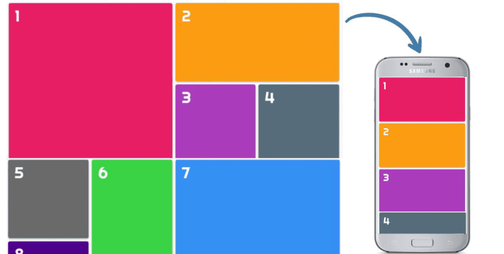
Steps to Create Responsive Grid Layouts
Step 1: HTML code:
<div class=”container”>
<div class=”item item-1″>1</div>
<div class=”item item-2″>2</div>
<div class=”item item-3″>3</div>
<div class=”item item-4″>4</div>
<div class=”item item-5″>5</div>
<div class=”item item-6″>6</div>
<div class=”item item-7″>7</div>
<div class=”item item-8″>8</div>
<div class=”item item-9″>9</div>
<div class=”item item-10″>10</div>
</div>
Step 2: CSS code
html, body{
padding: 0;
margin: 0;
box-sizing: border-box;
}
.container{
padding: 10px;
display: grid;
grid-template-columns: auto;
grid-template-rows: repeat(6 , 250px);
grid-gap: 10px 10px;
}
.item{
background-color: lightblue;
font-size: 50px;
padding: 10px 20px;
border-radius: 5px;
color: #fff;
font-family: ‘Righteous’, cursive;
box-shadow: 0 4px 5px 0 rgba(0,0,0,0.14),
0 1px 10px 0 rgba(0,0,0,0.12),
0 2px 4px -1px rgba(0,0,0,0.3);
}
.item-1{
grid-column: 1 / 3;
grid-row: 1 / 3;
background-color: #e91e63;
}
.item-2{
grid-column: 3 / 5;
grid-row: 1 / 2;
background-color: #ff9800;
}
.item-3{
grid-column: 3 / 4;
grid-row: 2 / 3;
background-color: #ab47bc;
}
.item-4{
grid-column: 4 / 5;
grid-row: 2 / 3;
background-color: #546e7a;
}
.item-5{
grid-column: 1 / 2;
grid-row: 3 / 4;
background-color: #6a6a6a;
}
.item-6{
grid-column: 2 / 3;
grid-row: 3 / 5;
background-color: #38cf44;
}
.item-7{
grid-column: 3 / 5;
grid-row: 3 / 6;
background-color: #2196f3;
}
.item-8{
grid-column: 1 / 2;
grid-row: 4 / 5;
background-color: #4a148c;
}
.item-9{
grid-column: 1 / 3;
grid-row: 5 / 6;
background-color: #6d4c41;
}
.item-10{
grid-column: 1 / 5;
grid-row: 6 / 7;
background-color: #e83835;
}
/* For Responsive Device */
@media screen and (max-width: 768px){
.container{
display: block;
}
.item{
height: 200px;
margin-bottom: 10px;
}
}
How it Works
- The design starts with a certain number of columns.
- The gutter width (space between columns) is static.
- The column width flexes and flows with the browser size (fluid grid).
- The column width is fixed and is at the center of the browser canvas (center grid).
Adaptive Images
A professional design service provides adaptive images that easily adjust to changing screen sizes and resolutions. A single image is created and scaled according to the display size, as per instructions given to the browser.
In particular, SVG files are preferable for non-photographic images like icons, especially when interactive visuals are being used to help simplify complex services. The file formats are lightweight, and you can quickly scale them to varying resolutions without losing the quality of the images.
Furthermore, one quick way to make media responsive is by using the max-width property with a value of 100%. Doing so ensures that as the viewport gets smaller, any media will scale down according to its container’s width.
img, video, canvas {
max-width: 100%;
}
For embedded media to be fully responsive, the embedded element must be absolutely embedded within the parent element. The main element needs to have a width of 100% so that it scales based on the width of the viewport. The parent element also needs a height of 0 to trigger the hasLayout mechanism in the browser.
Padding is then given to the bottom of the parent element, the value of which is set in the same aspect ratio of the video. This enables the parent element’s height to be proportionate to its width.
Remember the Professional Responsive Design formula from before? If a video has an aspect ratio of 16:9, 9 divided by 16 equals .5625, thus requiring a bottom padding of 56.25%. Padding on the bottom and not the top is specifically used to prevent Internet Explorer 5.5 from breaking and treating the parent element as an absolutely positioned element.
HTML code:
<div>
<iframe src=”https://www.youtube.com/embed/”></iframe>
</div>
CSS code:
div {
height: 0;
padding-bottom: 56.25%; /* 16:9 */
position: relative;
width: 100%;
}
iframe {
height: 100%;
left: 0;
position: absolute;
top: 0;
width: 100%;
}
Media Queries
Media queries are the instructions that alter the layout of the webpage for individual browsers and device circumstances. This component of a Professional Responsive Design instructs the browser to rearrange the elements on the screen if any changes in the screen size are detected. The specific site where the media breaks are called “Breakpoint.”
Media queries perform best with a mobile-first strategy, where you specify what you want on mobile and then scale up to all other browsers.
A breakout of mobile-first media queries might look like the following:
/* Default styles first then media queries */
@media screen and (min-width: 400px) {…}
@media screen and (min-width: 600px) {…}
@media screen and (min-width: 1000px) {…}
@media screen and (min-width: 1400px) {…}
For example, adding a media query for viewport 420 pixels.
HTML code:
<div class=”container”>
<section>…</section>
<aside>…</aside>
</div>
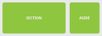
Without a media query, the Section and Aside look like the diagram above, as if it’s floating leftwards to the other section.
If we want to make it mobile-responsive, we can use the following media query:
CSS code:
@media all and (max-width: 420px) {
section, aside {
float: none;
width: auto;
}
}
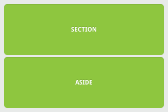
We remove the float using media queries. The Section and Aside can now span the entire width of the viewport.
Best Practices for Building a Professional, Responsive Website
Let’s look at some of the best practices for creating responsive websites.
-
Content is King
Content is the most valuable asset on a website. Therefore, you have to make sure users can find the relevant information with minimal browsing. That is fairly easy to achieve on a desktop as it takes less scrolling, but the same content on a mobile can become tedious to access without a responsive design.
-
Reduce the Clutter
Design your web page to serve its main goal. For example, if you’re selling a product, then focus on that and don’t include unnecessary buttons and CTAs. That is especially important for mobile devices because you have limited space and must prioritise important information first.
When you are designing for desktop then you can think of adding extra elements, such as newsletter and signups. However, remember to keep things simple for a better user experience.
-
Design for Thumbs
Mobile users hold their devices in their hands while accessing a website, which is why they need important parts of the page accessible by thumb.
At first glance, this might sound like a negligible difference, but it makes a big difference. On desktops, the navigation bar is at the top of the page. However, on mobile, it should be positioned in the middle or at the bottom so that people can reach it with their thumb.
-
Collaboration
Creating a responsive website requires collaboration between designers and developers. If they work in isolation, it can lead to readability issues, poor performance, and fewer user interactions.
Therefore, design and development must go together to put responsive web design into practice.
-
Keep Testing
Regular testing is essential to ensure your professional responsive website performs consistently across all devices and browsers. For instance, check the site navigation on each platform and try out different fonts for the text. Moreover, analyse the website’s performance on each device and browser.
You can use Google Analytics for this to see which browsers are most commonly used to access your website. Finally, page load speed matters, which is why you have to make sure the images, videos, and text on the web page doesn’t slow down the performance.
Conclusion
Let’s sum this up.
Creating a Professional Responsive Design requires the following practices:
- Use a mobile-first approach – start the design for mobile devices first and then proceed to other browsers.
- Set up appropriate responsive breakpoints – include 3 or more breakpoints for 3 or more different devices.
- Start with a fluid grid and adaptive images – prioritise the use of SVGs.
- Take touchscreens into consideration – use images, CTAs, or optimise these elements to render properly on multiple screens.
- Adjust the typography with responsive fonts – look for the unit named rems in the CSS3 specification.
- Test the responsiveness on real devices to validate the responsiveness of your web design.
Are you looking to build a professional responsive website that looks modern, mobile-friendly, and optimised for all devices? Xavor’s team of expert designers and developers can help you build a mobile-friendly website that you and your customers will love.
Contact us at [email protected] for further information.