
When it comes to building captivating mobile applications, user interface (UI) design plays a crucial role. In the world of cross-platform app development, Flutter has gained significant popularity for its ability to create stunning and intuitive user interfaces. Companies offering cross platform app development services prioritize developing delightful UIs – it is essential for delivering an enhanced user experience (UX) to users. Flutter design is rapidly catching on in the business world. This article explores the design principles and techniques specific to Flutter that enable Flutter developers to craft visually appealing and user-friendly interfaces. We will discuss the basics of Flutter design principles.
From the use of Flutter widgets and Flutter design principles to layout guidelines and responsive design, we will dive deep into the examples and best practices for creating beautiful UIs in Flutter design.
Benefits of Emphasizing Design Patterns in Flutter UI Development
1. Consistency
Following established design patterns ensures consistency across platforms, leading to a seamless and familiar user experience for both Android and iOS users.
2. Familiarity
Users are already accustomed to the design language of their respective platforms (Material Design for Android, Cupertino Design for iOS), resulting in a more intuitive and comfortable interaction with the app.
3. Efficiency
Leveraging existing design patterns reduces the need to reinvent the wheel, saving development time and resources while ensuring best practices are followed.
4. User Trust
Consistent and familiar design patterns instill confidence in users, making them more likely to trust and engage with the application.
Flutter Widgets and Composability
At the heart of Flutter’s UI design lies its extensive collection of widgets. Flutter design provides a vast array of pre-built widgets that serve as the building blocks for creating UI components. These widgets encapsulate various visual and interactive elements, such as buttons, text fields, images, and more. Flutter’s widget-based approach enables developers to compose complex UIs by combining and nesting widgets. With Flutter design you can be experimental.
Flutter widgets and Flutter user interface design are highly customizable, allowing developers to adjust their appearance and behavior to match the desired design. By utilizing Flutter design properties like colors, fonts, padding, and margins, developers can tailor the visual aspects of widgets to create unique and appealing UIs. Furthermore, Flutter widgets support animations, transitions, and gestures, empowering developers to create engaging and interactive user experiences.
Layout Guidelines and Responsive Design
Effective UI design requires careful consideration of layout and responsiveness. Flutter provides flexible layout mechanisms that adapt to different screen sizes and orientations, ensuring a consistent experience across multiple devices. The use of Flutter’s layout widgets, such as Container, Row, Column, and Flex, allows developers to arrange UI elements in a structured manner.
Flutter design follows a reactive UI model, where UI components automatically adjust to changes in device orientation or available screen space. By leveraging Flutter’s responsive design principles, developers can build UIs that gracefully adapt to different screen resolutions, aspect ratios, and device orientations. Flutter’s MediaQuery and LayoutBuilder widgets help in obtaining device-specific information and dynamically adjusting the UI layout accordingly.
Material Design and Cupertino Design
Flutter app development provides comprehensive support for Google’s Material Design and Apple’s Cupertino Design language, allowing developers to create visually consistent UIs for Android and iOS platforms. Material Design offers a set of design guidelines and components that promote a modern, sleek, and intuitive UI, while Cupertino Design embraces Apple’s minimalistic and elegant aesthetics.
Mobile app developers can utilize Flutter’s built-in Material Design widgets, such as AppBar, Card, Button, and SnackBar, to follow the Material Design principles effectively. These widgets of Flutter design adhere to Material Design guidelines, including elevation, shadows, and motion, resulting in visually appealing and user-friendly UIs.
Similarly, for iOS-specific interfaces, Flutter offers Cupertino widgets like CupertinoNavigationBar, CupertinoButton, and CupertinoAlertDialog. These widgets incorporate iOS design patterns, such as transparency, smooth transitions, and subtle animations, to create a seamless user experience consistent with the iOS platform.
Implementing SOLID Principles for Flutter UI
Developers can get caught up while coding, and messy code becomes a problem when the apps scales in complexity. The SOLID principles in Flutter are a set of five rules that define how to write good code using Dart.
SOLID is an acronym that stands for:
- Single responsibility principle
- Open/closed principle
- Liskov substitution principle
- Interface segregation principle
- Dependency inversion principle
SOLID affects how you structure UI code so widgets stay simple, testable, and easy to change.
1. Single responsibility principle
A class should have only one reason to change, meaning it should handle one specific responsibility. For example, a widget should focus on rendering UI. Business logic, API calls, and data formatting should live elsewhere.
2. Open/closed principle
Code should be open for extension but closed for modification. In simpler terms, it means that you should be able to add new functionality without changing existing code.
This make UI components reusable and extendable, so you can add variations without rewriting core components.
3. Liskov substitution principle
A subclass should be able to replace its parent class without breaking the program. So, if you create base UI components, any specialized version should work anywhere the base is expected without surprising behavior.
4. Interface segregation principle
Clients should not be forced to depend on methods they don’t use. Instead of one large interface, create smaller, specific interfaces. For UI design, this implies UI layers should prefer small, focused abstractions, so screens only depend on what they need.
5. Dependency inversion principle
High-level modules should not depend on low-level modules. Both should depend on abstractions. Therefore, UI should depend on abstractions, not concrete implementations.
Best Practices for Flutter UI Design
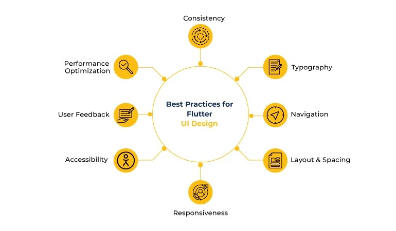
To ensure high-quality Flutter Design Principles, developers should follow certain Flutter pros and cons. Flutter UI design tool can help you with these practices. Some key practices in Flutter design include:
Consistency
Maintain visual consistency throughout your application. Use consistent color schemes, typography, and spacing to create a cohesive and unified user experience. Adhere to chosen design patterns and follow platform-specific guidelines, such as Material Design or Cupertino Design, depending on your target platform. Flutter design offers works best if consistent.
Typography
Pay careful attention to typography choices in your app. Select fonts that are easy to read, provide appropriate font sizes, and maintain consistent text styles across your UI. Consider legibility and ensure that text is properly aligned and spaced to enhance readability.
Navigation
Design intuitive navigation flows that enable users to easily navigate through your app. Utilize Flutter’s navigation widgets, such as Navigator, BottomNavigationBar, or Drawer, to create clear and accessible navigation structures. Organize your app’s content logically and provide appropriate visual cues for users to understand their current location within the app.
Layout and Spacing
Give careful thought to your app’s layout and spacing. Use Flutter’s layout widgets, such as Container, Row, Column, and Flex, to arrange UI elements of Flutter design in a structured and organized manner. Ensure proper alignment, consistent spacing, and appropriate padding to create a visually balanced and aesthetically pleasing UI.
Responsiveness
Implement responsive design principles to ensure that your app adapts gracefully to different screen sizes, orientations, and device resolutions. Leverage background tasks in Flutter and responsive design widgets in Flutter UI design, such as MediaQuery and LayoutBuilder, to create layouts that automatically adjust based on available screen space. Test your app on different devices to ensure a consistent and seamless user experience.
Accessibility
Consider accessibility guidelines when designing your Flutter UI design. A Flutter designer UI ensures that your app is accessible to users with disabilities by providing proper text alternatives for images, maintaining sufficient contrast between text and background, and utilizing semantic markup. Flutter provides accessibility support out of the box, but it’s important to design with accessibility in mind from the start when it comes to Flutter UI components.
User Feedback
Provide visual feedback to users for Flutter UI components to enhance their understanding and interaction with your app. Utilize animations, transitions, and micro-interactions to provide visual cues and responses to user actions. Incorporate progress indicators, error messages, and tooltips to guide users through the app and provide feedback on their actions.
Performance Optimization
Optimize your UI for performance to ensure smooth and responsive user experiences. Smooth and intuitive Flutter design can optimize performance. Minimize unnecessary widget rebuilds by using const constructors or StatelessWidget where appropriate. Implement efficient data fetching and caching strategies to minimize network requests and reduce loading times. Flutter’s hot reload feature is a valuable tool for quickly iterating and fine-tuning your UI for optimal performance.
Conclusion
Flutter empowers you to create stunning and intuitive user interfaces by embracing design principles and techniques specific to the framework. By leveraging the Flutter Design Principles library, flexible layout capabilities, and support for design languages like Material Design and Cupertino Design, developers can craft visually appealing and user-friendly UIs for their cross-platform applications.
And, don’t forget to have smooth and intuitive Flutter design. Following best practices ensures consistency, responsiveness, and accessibility, resulting in engaging and delightful user experiences. With Flutter’s design-centric approach, your team of Flutter developers can bring your UI visions to life and captivate users with beautiful and intuitive interfaces.
Xavor has a top-notch Flutter app development team, skilled at using industry best practices to develop intuitive and delightful Flutter UI/UX. Are you looking to hire Flutter developer? Drop us a line today at [email protected] to get a free consultation session!

FAQs
Flutter widgets are pre-built elements like buttons, text fields, and images that serve as the building blocks for UI components, allowing developers to create interactive user interfaces.
Flutter widgets are highly customizable, enabling developers to adjust appearance and behavior using properties like colors, fonts, padding, and margins to create unique and visually appealing UIs.
Flutter provides comprehensive support for Google’s Material Design and Apple’s Cupertino Design, allowing developers to create visually consistent UIs for Android and iOS platforms, respectively.